How to Read an Outdoor Lighting Gallery Before You Buy
Reading an outdoor lighting gallery correctly means looking past the wow shots to fixture placement, color choices, and home style. Here's what actually to look for.
Reading an outdoor lighting gallery well means looking past the most dramatic photos and paying attention to fixture placement, color temperature, and how the lighting relates to the home's actual architecture. A gallery photo taken at peak color saturation on a big holiday looks different from what most homeowners want running as a default setting.
Our own gallery includes a range of installs, and homeowners researching permanent lighting or landscape lighting often ask how to translate what they see in photos to what their own home would realistically look like.
Here is what to actually pay attention to when browsing lighting galleries, ours or anyone else's.
Look at where fixtures actually sit, not just the glow
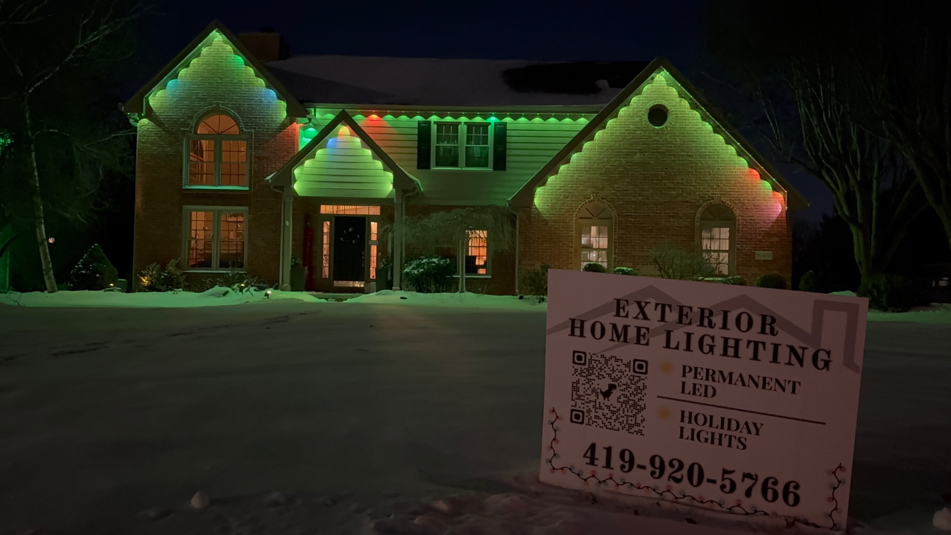
It is easy to get drawn into the overall warm glow of a nighttime photo without noticing where the individual fixtures or track are actually placed on the home. Following the fixture line along the roofline, around windows, or up columns tells you more about how the system was actually installed than the ambient light does.
Homes with permanent track systems like Jellyfish typically run continuous lighting along roof edges, gables, and sometimes around windows, so look for how closely the track follows the architectural lines of the home rather than sitting in a generic straight run.
This detail matters more once the lighting is off during the day, since a well-placed track is barely noticeable, while poorly planned placement can look obvious even when not lit.
Compare home style and scale honestly
A single-story ranch with a simple roofline is going to look different lit up than a two-story home with multiple gables and dormers, even using the same lighting product. When browsing a gallery, look for homes with a similar architectural style and scale to yours for the most realistic comparison.
Roofline complexity affects both the visual result and the amount of lighting needed to cover it well, so a photo of a large, elaborate home is not necessarily representative of what a smaller, simpler home would look like with the same system.
If nothing in a gallery closely matches your home, that is normal. It just means the photos are more useful as a general style reference than a literal preview.
Understand what color and brightness settings you're seeing
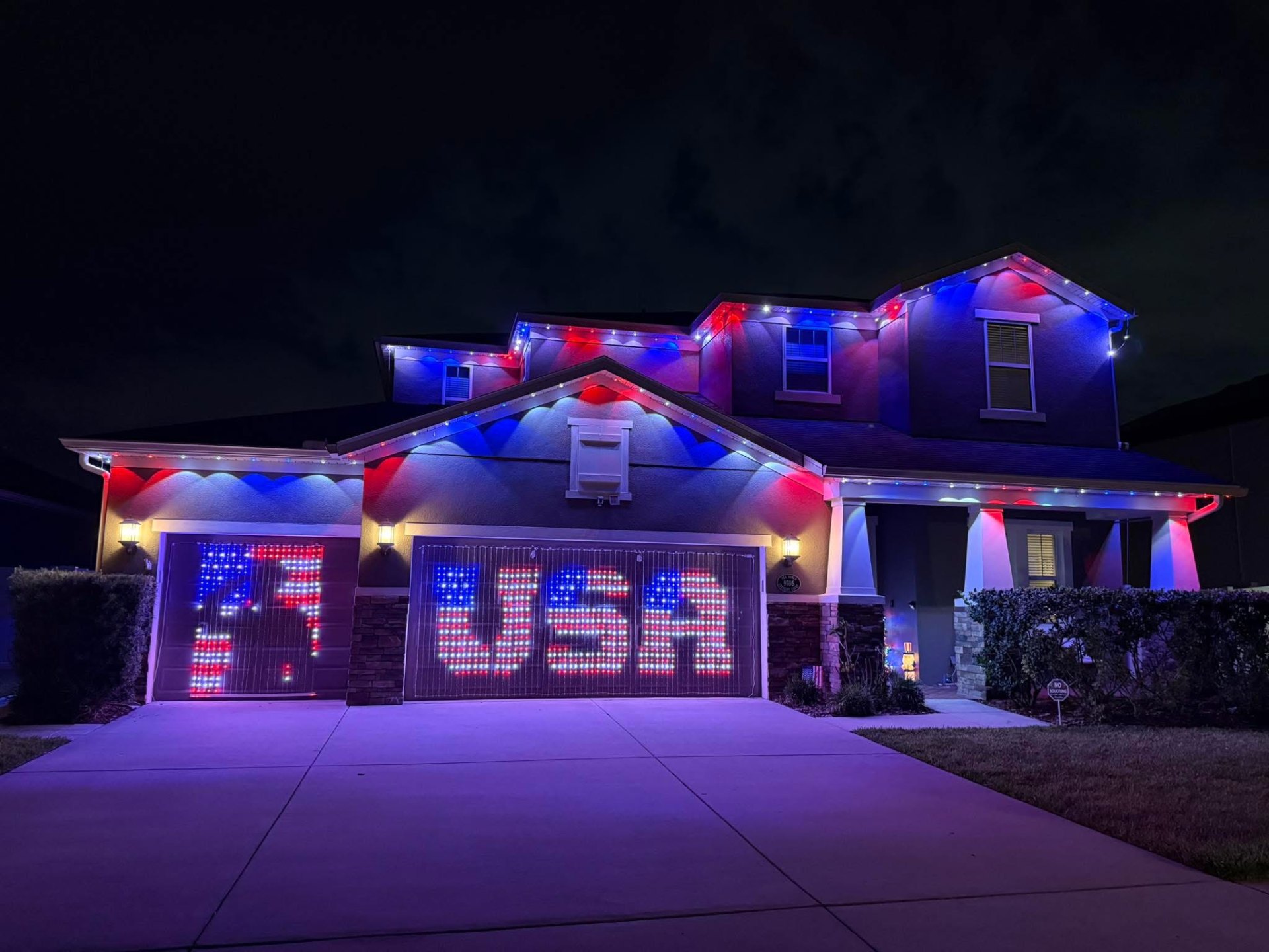
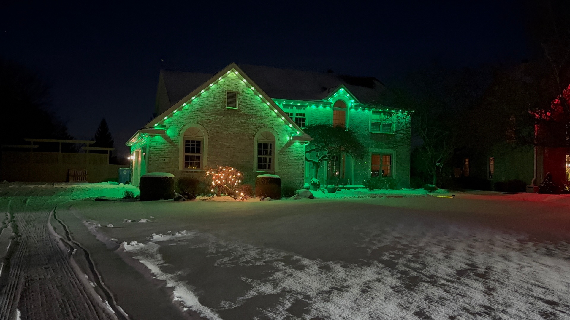
Many gallery photos, especially for RGB-capable systems like Govee, show a specific color scene set up for a holiday, event, or simply to showcase the product's range. That is a fair thing to show off, but it is worth remembering that most homeowners run a simpler warm white or a rotating scene most nights, not full saturated color every day.
If a photo catches your eye because of a specific color combination, ask whether that is a scene you can save and switch to on demand versus something that requires constant manual adjustment.
Warm white photos are generally a better representation of everyday use for most homeowners, while colorful scenes are better thought of as an occasional feature rather than the default look.
Daytime appearance matters as much as nighttime photos
A gallery focused entirely on nighttime shots does not tell you much about what the fixtures or track look like during the day, which matters since your home wears that hardware around the clock, not just after dark. Ask to see or ask about daytime appearance if a gallery does not include it.
Well-installed permanent track is designed to blend into the roofline and be minimally visible in daylight, but this depends on installation quality and how closely the track color matches the home's trim.
This is a reasonable question to bring up during a quote conversation if daytime appearance matters to you, since it is not always obvious from nighttime photos alone.
Watch for consistency and evenness across a run
One marker of a well-executed install is even spacing and consistent brightness across the full length of a lighting run, without noticeable gaps, overly bright hot spots, or visible seams between sections. This is easier to judge in wide shots that capture a full roofline rather than tightly cropped close-ups.
Close-up photos are useful for seeing fixture or track detail, but wide shots tell you more about how the whole system reads from a normal viewing distance, which is how you will actually experience your own lighting most of the time.
If a gallery only shows close-up shots of small sections, it is fair to ask for a wider view before assuming the full installation looks as clean end to end.
- Follow the fixture or track line against the home's actual architecture
- Compare homes of similar size and roofline complexity to yours
- Note whether a color photo represents an everyday setting or a special scene
- Look for daytime photos, not just nighttime shots
- Prefer wide shots that show a full run over only close-up details
Bringing gallery examples into your own quote conversation
The most useful way to use a gallery is to find a few photos that represent the look you want, whether that is a specific color temperature, a particular architectural highlight, or an overall brightness level, and bring those into your quote conversation directly.
This gives whoever is doing your free quote a concrete reference point instead of a vague description, and it is easier to say whether a specific look is achievable on your home once there is a real example to discuss.
It is also fine to bring examples from outside our own gallery if something you saw elsewhere caught your attention. The goal is a shared reference point, not restricting yourself to one company's photos.
Frequently asked questions
Are gallery photos edited to look brighter than reality?
Camera settings for night photography, like longer exposure times, can make lighting look more saturated or brighter than it appears to the naked eye. It is a fair question to ask about any specific photo you are drawn to.
How do I know if a gallery photo shows a special scene or an everyday setting?
Bold, fully saturated colors are usually special scenes, while warm white or simple color combinations are more typical of daily use. Ask directly if you are unsure about a specific photo.
Should I only look at homes similar to mine in a gallery?
It helps for realistic comparison, but it is not required. Photos of different home styles can still be useful for judging color temperature, fixture spacing, or overall quality of installation.
Can I bring in photos from other companies' galleries during my quote?
Yes. Bringing any reference photo that shows the look you want helps clarify what you are hoping to achieve, regardless of where the photo came from.
The bottom line
- Look at fixture placement relative to architecture, not just overall brightness.
- Compare home style and roofline complexity for a realistic sense of what to expect.
- Recognize which photos show everyday settings versus special color scenes.
- Check for daytime appearance, since fixtures are visible around the clock.
- Bring specific gallery photos into your quote conversation as a reference point.
See real installs before you decide
Browse examples of permanent and landscape lighting across different home styles to find a look that fits yours.
View the gallery