A permanent lighting system should make your home look intentional, not like every available color was switched on at once. The best displays use color to highlight your roofline, fit the occasion, and complement the materials already on your home. This guide to jellyfish lighting colors will help you choose combinations that feel polished for holidays, celebrations, security, and everyday curb appeal.
Jellyfish Lighting gives homeowners remarkable flexibility, but flexibility works best with a clear plan. A warm white display can make a brick home feel inviting on an ordinary evening. The same roofline can shift to team colors for game day, red and green for Christmas, or purple for a family celebration. With a professionally designed and installed system, those changes can happen without climbing a ladder or storing seasonal strands in the garage.
Start With Your Home’s Exterior, Not the Color Wheel
Before choosing a favorite color, look at what your house already brings to the picture. Brick, siding, stone, trim, shutters, roofing, and landscaping all affect how lighting reads from the street. A color that looks sharp on a modern white-and-black exterior may feel too stark against warm tan stone or traditional red brick.
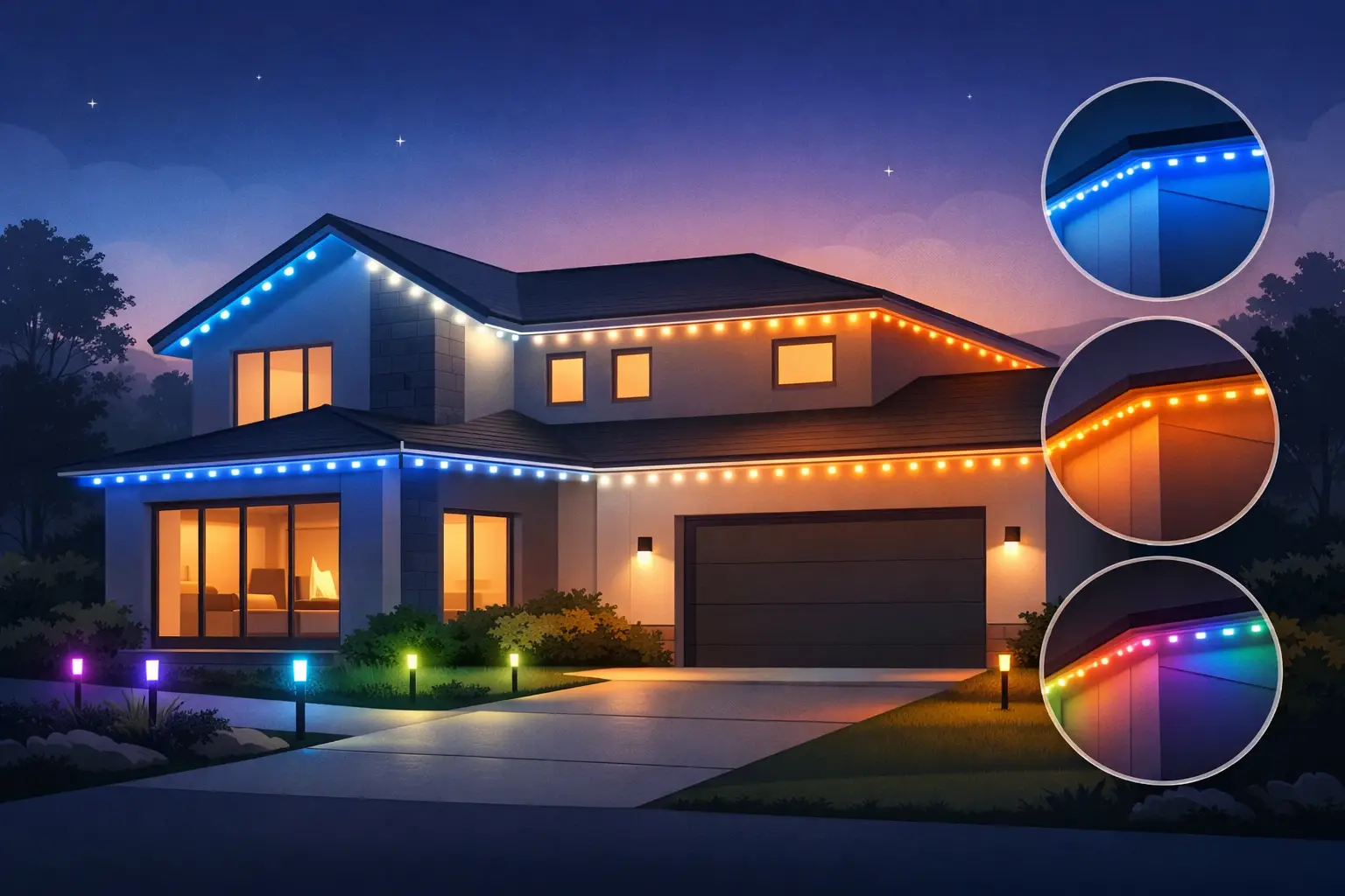
Homes with warm exterior materials often look best with warm white, amber, soft red, and muted green. These colors support the natural warmth of brick, bronze fixtures, wood-toned doors, and cream trim. Cooler exterior palettes – such as gray siding, charcoal roofs, slate, or black trim – can handle crisp white, blue, icy purple, and saturated jewel tones especially well.
That does not mean a warm-toned home cannot use blue or a modern home cannot use amber. It means the color should look chosen, not accidental. If you are unsure, start with a simple two-color pattern rather than a fast-moving multicolor sequence. From the curb, restrained color usually looks more premium.
Everyday Jellyfish Lighting Colors That Add Curb Appeal
For most homeowners, the color used most often will not be a holiday pattern. It will be an everyday setting that adds definition after sunset while still feeling appropriate for the neighborhood.
Warm White for an Inviting, Finished Look
Warm white is the closest match to traditional outdoor lighting. It brings out rooflines and architectural details without calling too much attention to itself. It is a reliable choice for brick homes, covered porches, homes with warm landscape lighting, and households that want a welcoming appearance throughout the year.
Warm white also pairs well with other exterior improvements. Fresh mulch, neatly edged beds, a new front door, or trimmed shrubs are easier to appreciate when the home has a soft, even glow at night.
Crisp White for Modern Contrast
Crisp white creates a cleaner, brighter look. It works particularly well with contemporary homes, white siding, black accents, silver-toned fixtures, and sharply defined rooflines. The trade-off is that cool white can appear more intense than warm white, especially on a smaller home or a street with limited ambient light.
If your goal is subtle elegance, consider a lower-brightness crisp white setting rather than running the system at full intensity. More brightness is not always more attractive.
Soft Accent Colors for a Signature Look
A single soft color can give a home personality without making it look like a special-event display. Deep blue, forest green, muted purple, or amber can all work as occasional evening settings. These are especially effective when used consistently, such as a blue roofline on weekend evenings or a gentle green setting during the spring and summer.
The key is consistency. A single-color display feels deliberate. A mixture of unrelated colors can make an otherwise beautiful exterior look busy.
Choose Holiday Colors With Contrast in Mind
Holiday lighting is where Jellyfish Lighting colors can have the biggest visual impact. The strongest holiday displays are easy to recognize at a glance because they use familiar colors with enough contrast to stay clear from the road.
For Christmas, classic red and green remains popular for good reason. The colors are immediately recognizable and look especially good with warm white as a third accent. Red, green, and warm white can be arranged in repeating sections, alternating pairs, or a simple chase pattern. If your home already has colorful decorations, use the roofline lighting as the clean framework rather than adding more competing colors.
For Halloween, orange and purple are a dependable combination. Orange and green create a more playful look, while purple and deep blue can feel moodier. Avoid using every spooky color at once unless you are aiming for a bold, family-focused display. Two colors with an occasional animated effect often look more dramatic than a constantly changing rainbow.
Patriotic holidays call for red, white, and blue, but the white temperature matters. Crisp white typically gives this combination a sharper, more traditional contrast. For St. Patrick’s Day, green with warm white is often more refined than green alone. For Valentine’s Day, red, pink, and soft white provide a festive look without overwhelming the home.
Use Team Colors and Event Displays With Restraint
One of the most enjoyable reasons to install permanent outdoor lighting is the ability to support your favorite team, host a graduation party, or mark a birthday in minutes. Team colors are highly personal and make a home feel part of the celebration.
For sports displays, two team colors are usually enough. If your team has a neutral color such as white, gray, or black, use it as spacing between the primary colors rather than treating it as an equal part of every pattern. This keeps the design readable from across the street.
For graduations, showers, birthdays, and anniversaries, consider the event’s colors but keep the roofline separate from table decor, balloons, and yard signs. A simple alternating pattern in school colors or a single celebratory color can provide the backdrop without turning the entire exterior into visual clutter.
How Bright Should Jellyfish Lighting Colors Be?
Brightness is just as important as color. A setting that looks impressive from the street can feel harsh when viewed from a front bedroom, a neighbor’s driveway, or a nearby sidewalk. The right level depends on your home’s setback, roof height, surrounding streetlights, and the darkness of the neighborhood.
A home on a busy, well-lit road may need more intensity for its roofline to stand out. A home on a quiet residential street often benefits from a softer setting. Brightness can also change by season. In Northwest Ohio and Southeast Michigan, winter darkness makes even modest color settings visible, while summer evenings may call for a slightly stronger display.
For everyday use, aim for a level that defines the home rather than floods it. Save high-intensity animated settings for short-term celebrations and major holidays. This approach is easier on the eyes and gives special displays more impact when you do use them.
Create a Color Plan for the Whole Property
Roofline lighting looks its best when it works with the rest of the property. If you have landscape lighting, patio lighting, a water feature, or decorative outdoor elements, think of them as part of one nighttime design.
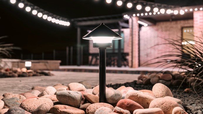
In most cases, landscape lighting should remain warm white while the roofline carries the seasonal color. Warm path and uplighting help people move safely around the property and preserve the natural look of trees, beds, and stonework. Meanwhile, the roofline can handle a holiday color pattern without creating an overly saturated yard.
There are exceptions. A commercial property, a large event, or a home with a long drive may benefit from coordinated color across several lighting zones. The important part is assigning each area a role. Rooflines create visibility from the street. Landscape lighting adds depth. Patio lighting supports comfort and useable outdoor space.
Why Professional Color Design Makes a Difference
The app makes changing Jellyfish Lighting colors convenient, but the finished look begins with installation design. Fixture placement, spacing, roofline layout, mounting method, and how the system follows the architecture all influence the way colors appear after dark. A well-installed system looks clean in daylight and produces even, intentional illumination at night.
Hamilton Home Accents helps homeowners choose a permanent lighting layout that fits the architecture of the home and the way the family plans to use it. As a family-owned, licensed, and insured exterior improvement company, the team focuses on custom design and visible workmanship rather than a one-size-fits-all approach.
Your favorite colors should make the house feel more like yours, whether that means a quiet warm white glow on a Tuesday night or a full team-color celebration before the big game. Start with the character of your home, keep everyday settings simple, and give the bold patterns a reason to shine.